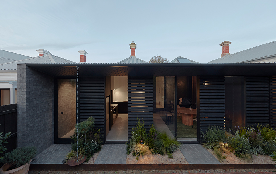
A recent renovation and lean-to addition to a heritage listed cottage in Brunswick proves that sometimes, the result is greater than the sum of its parts.
At first glance, this heritage listed home paired with the original dilapidated lean-to addition - hosting an awkward layout and lack of aspect - could have felt like a recipe for disaster. For Blair Smith Architecture and his clients however, there was clear potential and a path to seeing the old Victorian cottage in a new light.
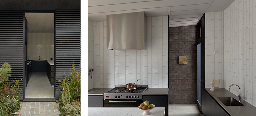
Purging the shortcomings of yesteryear and their bad construction practices, the new lean-to is efficient, practical and usable. It contains a kitchen (with walk-in pantry), laundry and a main bathroom. By leaving the living room in the original building, Smith was able to minimise the footprint while maximising the new building, yard and aspect. The new lean-to never tries to overcompensate or fill the lot, but instead displays a refreshing confidence with its pragmatic complementary design.
The colour palette is a balance of dark and moody structural elements, lifted by lighter, textural additions that add a contemplative nature to the space. This is perhaps best exemplified by the northern light that is filtered through by the main exterior design detail - the slatted, timber shutters – and the emotive shadows this casts across the space, establishing a feeling of peace and quietude.
“We used recessive materials” says Smith of the palette, “making sure it fit in context.” A preference for low-level lighting continues the theme, with fixed fittings, floor lamps and wall sconces setting the scene, leaving the panelled ceiling uninterrupted and clean.

The use of external slatted timber screens to control heat, glare and privacy gives the occupants multiple layers of control over the space, as well as being a stunning and eco-conscious design feature. Split into eleven modules, with three operational sliding screens on a single track, when closed they act as a cohesive yet adaptable barrier, subverting the idea of transparency and opacity. With the screens closed and doors open, air flow and passive cooling can be securely managed, even with the occupants away. Constructed with a nod to mid-century modernism and a ‘gentle’ brutalist materiality, the grey brick and black timber is a perfect accompaniment to the original building and the garden it bridges. The natural elements approach the lean-to from the outdoor area, blending and welcoming it into their space.
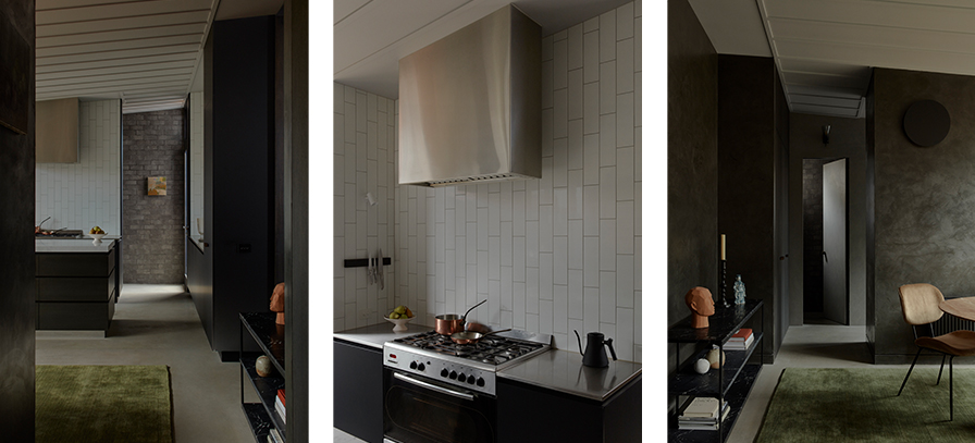

The bricks continue inside, blurring the line between the spaces and the themes of the building further. Laminex Black in AbsoluteMatte is used in the kitchen cabinetry, its nonreflective qualities make sure Smith’s approach to lighting is uninterrupted.
“It complements the screens and windows, and the brickwork. It was about finding a tone and a material that was not at odds with those other key selections. So, it is kind of like a backdrop material. It’s recessive, and I mean that as a positive, as a compliment to the product. There are so many products in the range that you can really make sing, but it wasn’t about that for this, it just needed to fit the context,” says Smith.
The success of this project is it steadfastness and clarity, doing exactly what it needs to do to fulfill the brief and clients’ desires. Of course, that it has been built with thoughtful and considered materials makes a strong case, and where modern real estate might have had it expanding unnecessarily further, adding more rooms for the sake of it, Brunswick Lean-to uses a ‘less is more’ approach to rise above the average or the expected. By deliberately being enough, the Brunswick Lean-To project has revived a heritage space, and added to a home that can now be experienced as greater than the sum of its parts.
Learn more about the project here.
Design:Blair Smith Architecture Photography: Tom Ross


