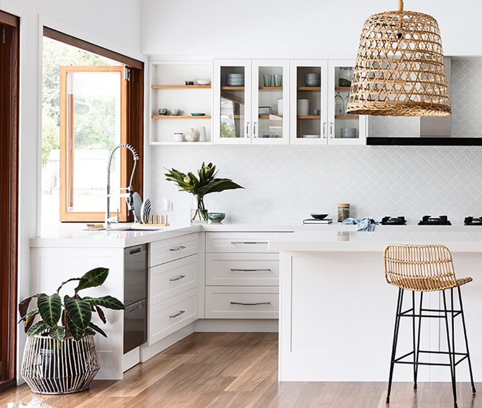
The design strategies at play in this recent new build show how surface material specifications in kitchens, bathrooms and laundries can make a house feel like a (very stylish) home.
Don’t spend too much time scanning through the text here to find the name of the architect who designed this beautiful new Sunshine Coast house, because you won’t find it. Its owner, Nicole Earsman, whose practical design experience was limited to a previous home renovation, designed it herself.
Looking at the images, you’ll no doubt agree that it’s an impressive achievement, but for kitchen and bathroom designers, it also gives valuable insight into the priorities and aspirations of modern Australian homeowners, and the role that surface materials can play in a larger design strategy.

Using surface materials to create connections
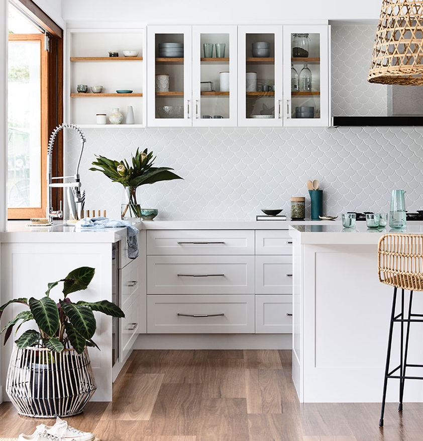
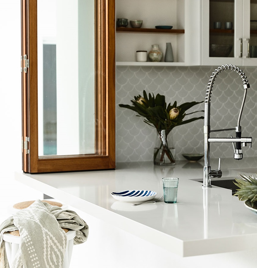
Earsman’s active young family loves being outdoors and they are keen entertainers,so creating strong connections between interior and exterior spaces was a focus of the design. This is most obvious in the home’s open-plan living area, which flows out through bifold doors onto a large courtyard. To heighten the perception of connected spaces, the kitchen bench extends out through folding windows, forming an outdoor breakfast bar. It’s not a bad place to start the day on a warm Sunshine Coast morning!
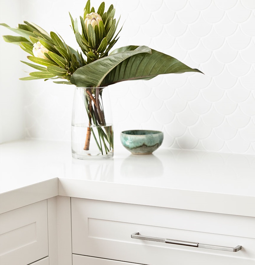
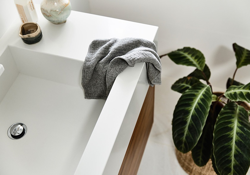
The benchtop was fabricated from Essastone Crystallite in Gloss finish, and this decor was also used for the kitchen island benchtop and on vanities in the bathroom and laundry, and on the splashback in the laundry.Using the same material in different parts of the house creates a strong sense of cohesion and flow between the spaces, and a feeling of familiarity for the family.

Colour and texture creating a relaxed coastal feel
"My favourite colour is white," says Earsman. "It's clean and fresh." But it can also be cold and clinical – too clean – if used to excess, and the palette here acknowledges that. While the walls, cornices, skirting boards and architraves are all white, and kitchen cabinetry has been made with Laminex ColourTech doors in Polar White, they’re balanced with raw, natural materials like jute and rattan, sandstone wall surfaces, hardwood door and window frames, and a rustic timber dining table, as well as timber-look flooring.
The white surfaces help to maximise ambient light in the house, the natural materials bring a sense of warmth and texture, and thanks to Earsman’s deft touch, together they bring a relaxed Coastal-style feeling tothe interior that’s wholly appropriate to the coastal location.
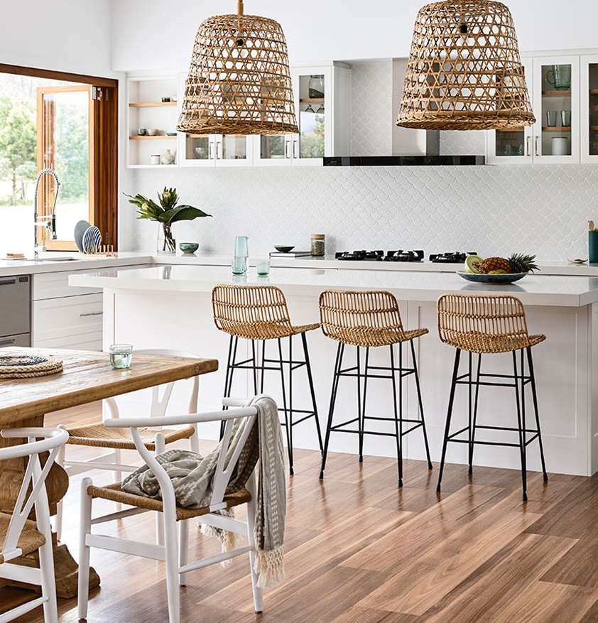

The Laminex ColourTech doors play into this aesthetic approach, as they were specified in theShaker profile for the classic Hamptons look. The choice of Essastone Crystallite was also crucial, with its warm white tones mitigating the starkness that might’ve come with a more pure-white decor.And Essastone also serves the brief for highly durable surfaces befitting a family with energetic young children! The choice was a "no brainer", according to Earsman. "It’s hardwearing, easy to maintainand brings a layered, textural feel which works perfectly with the coastal vibe."
Beyond the photographs, daily life in this beautiful home is a joy for Earsman and her family, and that, of course, is the ultimate mark of success. "I absolutely love our home," she says. "The inside-outside, free-flowing mood has turned out exactly how I pictured it." It’s a wonderful outcome for the owners, and also an insightful case study for designers.


Products featured
Kitchen: Essastone Crystallite Gloss benchtops &Cabinetry in Laminex ColourTech painted doors in Polar White Satin finish with a shaker profile.
Bathroom & Laundry: Essastone in Crystallite Gloss finish vanity top.
Cabinetry: Greystone Cabinets
Stone: Signature Stone QLD
Build: Saltbush Constructions
Photography by Derek Sewell


