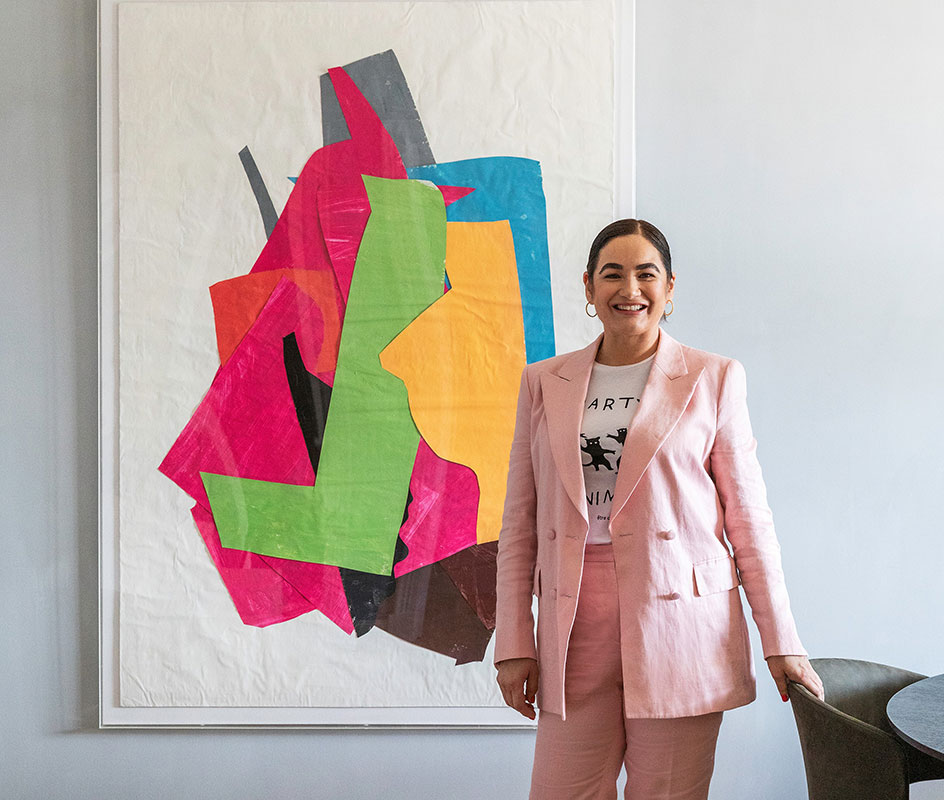
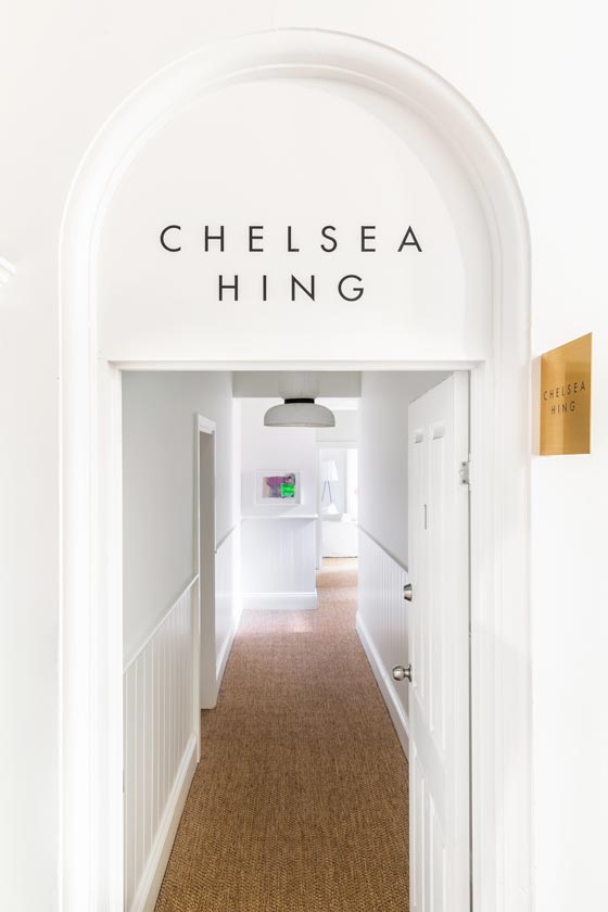
When interior designer Chelsea Hing was looking to buy a home in Victoria’s Macedon Ranges region last year, she felt like half of Melbourne had the same idea. And this presented an opportunity. With the pandemic prompting more city dwellers to seek a tree change in the region, Hing put her house-hunt on hold and opened a design studio in the heart of Daylesford. “I realised that change was happening in the area and, if we could establish a presence, we could better service Melbourne clients who were moving there,” says Hing. “We started looking immediately and found the perfect space in the top floor of a grand historic building in the centre of town.” So she now enjoys the best of both city and country, with her new Daylesford studio operating alongside her practice in South Melbourne, which she established back in 2007.

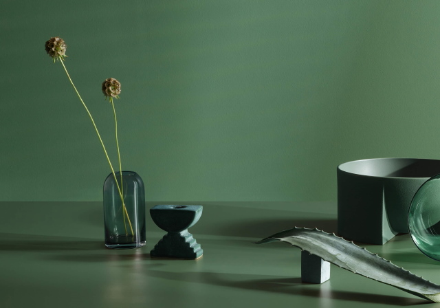
Using colour for dramatic impact and to create mood
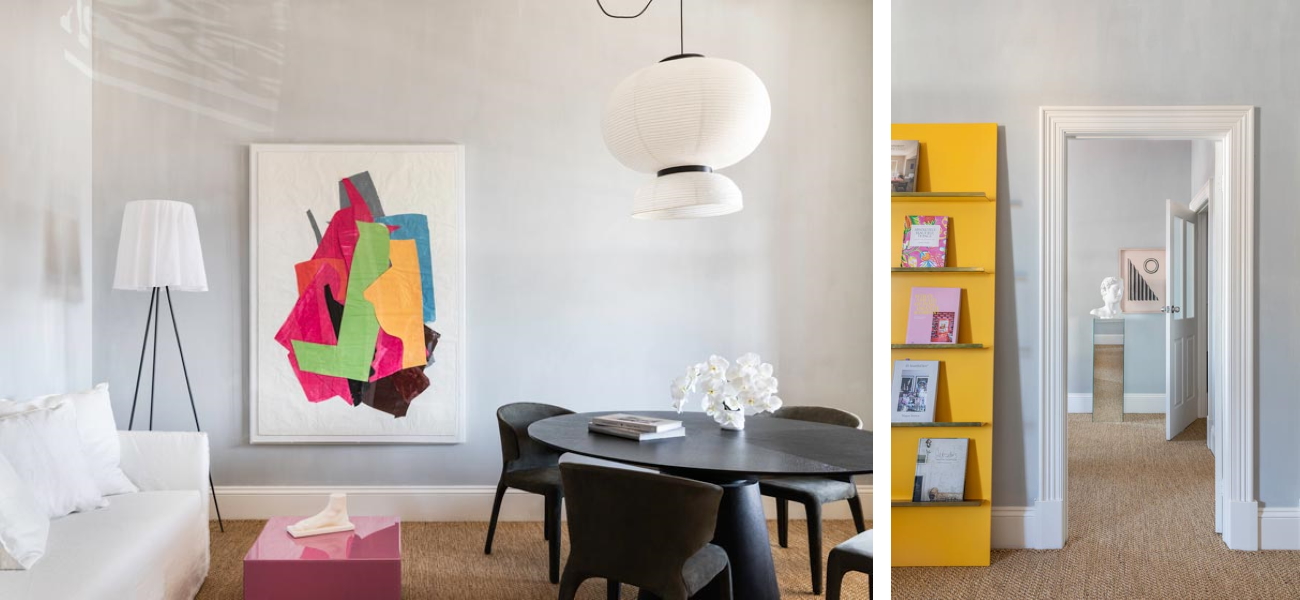
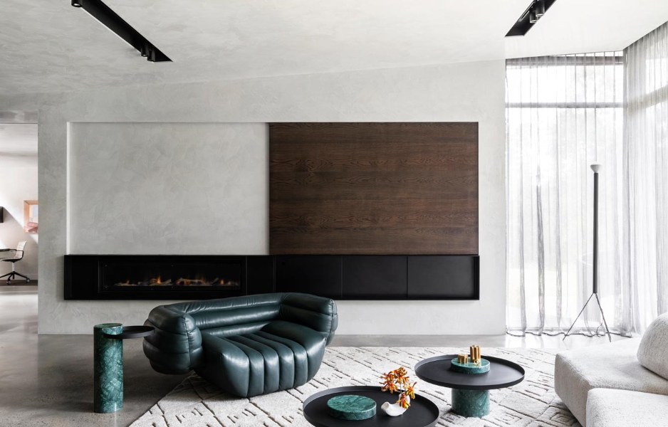
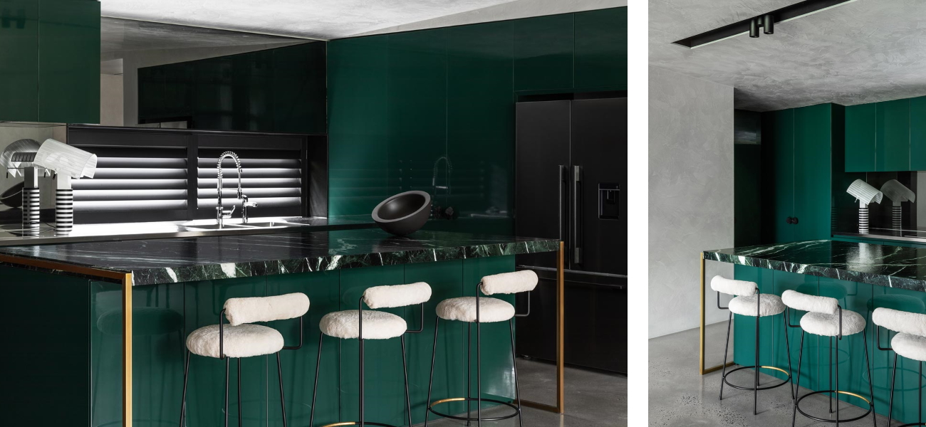
The Daylesford studio functions as an office, but it feels more like a home, with lime-washed walls, textural sisal floors and the bursts of bright colour that are a signature in many of Hing’s residential designs. “I like exploring ideas for how to apply excitement in a space, and I think excitement comes from things that are unexpected,” she explains. “Nothing that we do is necessarily so far out of the box. If it’s a cosmetic update, for instance, to what extent can we use our toolbox to create a real impact? Colour is a very strong way to do that and it creates a totally transformative result.”
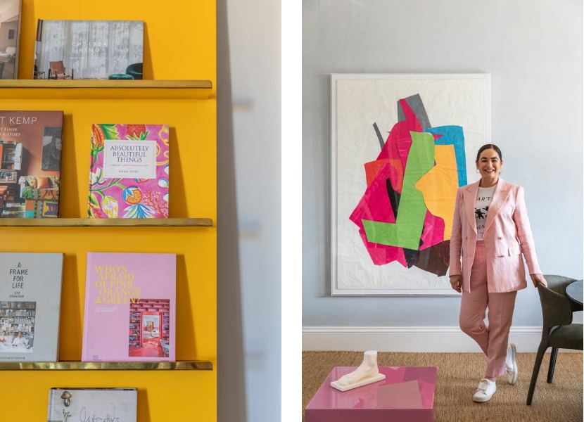

“You need to think deeply about colour because it evokes emotion, so it's got to feel right. There's nothing worse than colour that's jarring.”
Chelsea Hing – interior designer

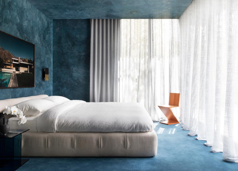
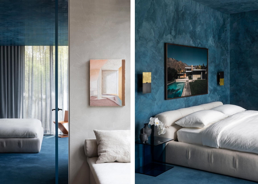
A good example of this approach is the Camberwell House, where ceilings, doors and cabinetry are painted a bold French blue, creating an irresistible sense of drama in the refurbished California bungalow. But Hing also uses colour to make spaces more liveable. In the Orchard House, for instance, she wrapped the entire master bedroom – ceiling, walls and carpet – in blue to “dial down the light”. As she explains, “Use of colour is often site-specific and, in this case, the bedroom was just swamped in light, so the colour gave it a bit of mood and made it feel like a room you want to be in and, obviously, sleep in.”

Focusing on how clients want to live
This philosophy of colour is consistent with Hing’s broader approach to design, which gives paramount consideration to her clients’ preferences and personalities. “We're always trying to wrap up our clients in a space that reflects how they want to live in the world, whether it’s something that feels rewarding, comforting, expansive, exciting, innovative or interesting,” she says.
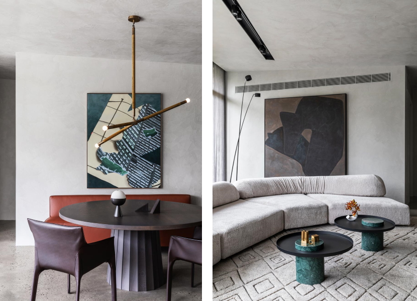

Unsurprisingly, material selections are also a key part of this. “I’ve progressively refined our material pallet to natural finishes as much as possible,” Hing says. “I’m into texture and materiality, because I think that creates a beautiful interplay between finishes.” Laminate also plays a role, often used to bring colour and texture to cabinetry and storage in kitchens and butler’s pantries. “We particularly look to laminate for inventive ways to use internals of joinery,” she says. “If there are dark-coloured joinery doors, for example, an oak finish on the inside provides a bit of visual relief.”


With the design and refurbishment of her new Daylesford studio now complete, Hing has resumed her search for a home nearby. “I’m still looking for a project of my own in the region,” she says. “I think opening the studio in Daylesford last year was a bit of a left-field idea, but COVID precipitated that kind of thing. And I can’t wait to be up there more often.”
Chelsea Hing – Interior Design Studio
Website: https://www.chelseahing.com.au/
Instagram: @chelsea_hing


