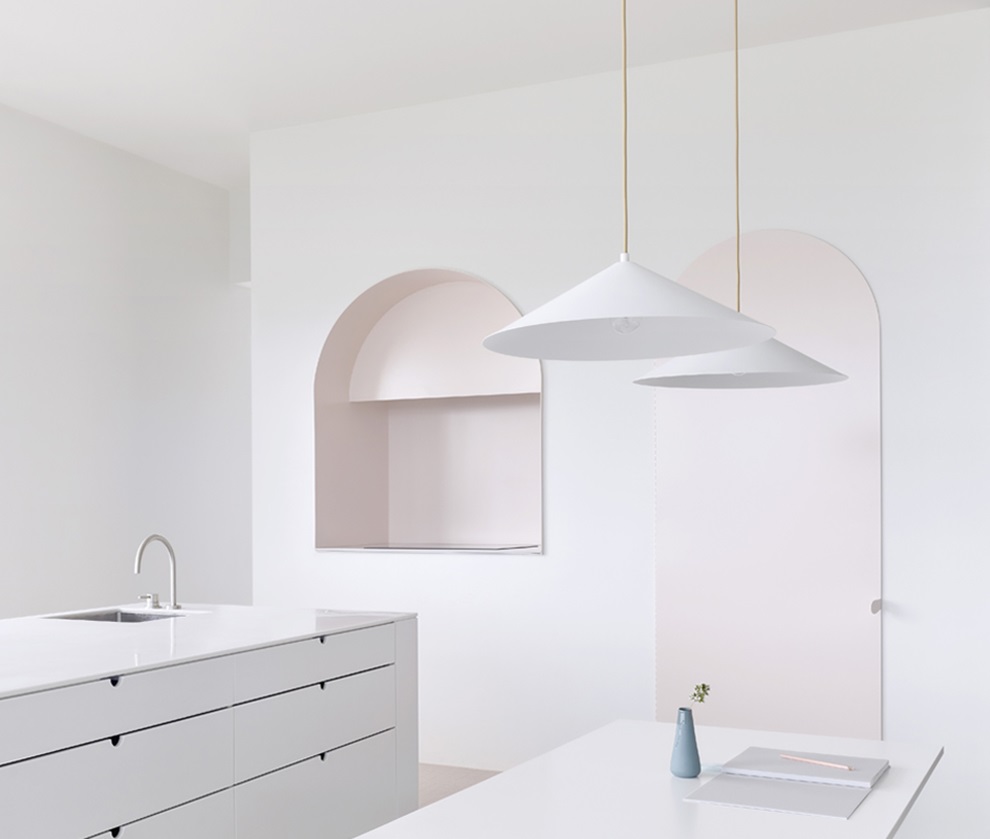
White features strongly among our paired Laminex and Dulux® colourways, so we asked Brad Swartz, Holly Board, Pete Grove and Annabelle Bradbury to tell us about recent projects of theirs where white predominates.
White is incredibly popular in Australian interiors, but that doesn’t mean it’s simple to work with. Matching whites across materials with different physical properties can be challenging, lighting conditions can have a strong impact on how those whites look and, of course, choosing the right white will depend on the specific effect a designer wants to achieve. Here, architects Brad Swartz, Holly Board, Pete Grove and Annabelle Bradbury share their thinking behind recent architectural projects that combine white paint, laminate and other materials.
Brad Swartz from Brad Swartz Architects
The owner of a terrace house in Pyrmont wanted to build a double-storey rear lane addition as a short-term rental property, but was worried that his neighbours would complain. So he asked if they’d like to join in the project and it became a pair of mirrored additions. They approached us to do the design and Loft House x2 was born!
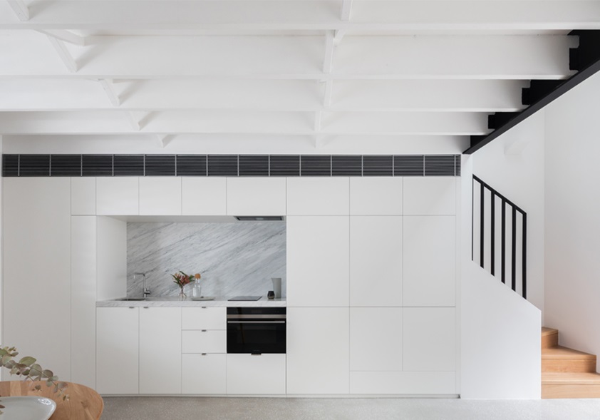

Our aim was to create something that subtly fitted into the laneway, but that was more unique when viewed up close, and then internally to provide a kind of oasis in the city. To maximise the floorspace, we confined services to the tightest possible area, tucked in next to the stairways and concealed in a wall of white joinery.
We went with white for the reason we use it in lots of projects – to create the biggest feeling of openness in a relatively small volume. When all of that joinery’s closed, it becomes like another white wall. It doesn’t shout out, “Hey I’m a kitchen!” It essentially disappears. Also, with a large commercial building to the north, we used the white surfaces to bounce as much light as possible from skylights and windows.
We chose colours for the walls and joinery that we use quite a lot, Dulux Vivid White and Laminex Polar White. When they’re on the same face you might pick up a slight variance in colour, but they tend to pick up different shadows and different light so it’s not very noticeable. And then we painted the exposed ceiling in quite a glossy white to mix up the textures. That slight reflection helps raise the ceiling a bit. It’s minimal but then it’s these very subtle things that can really enhance an interior space.
Holly Board and Pete Grove from BoardGrove Architects
When we came to the Footscray Apartment, it was a sea of plasterboard and downlights, with three different bulkhead heights, plastic timber flooring and a cheap galley kitchen running along the back. It had windows on three sides, but once you engaged with the depth of the apartment, it was quite dark and compartmentalised. So part of our aim was to maximise the natural light. The corridor and bedrooms at the rear were opened up, and the ceilings in the living, kitchen and corridor space were removed and lifted.
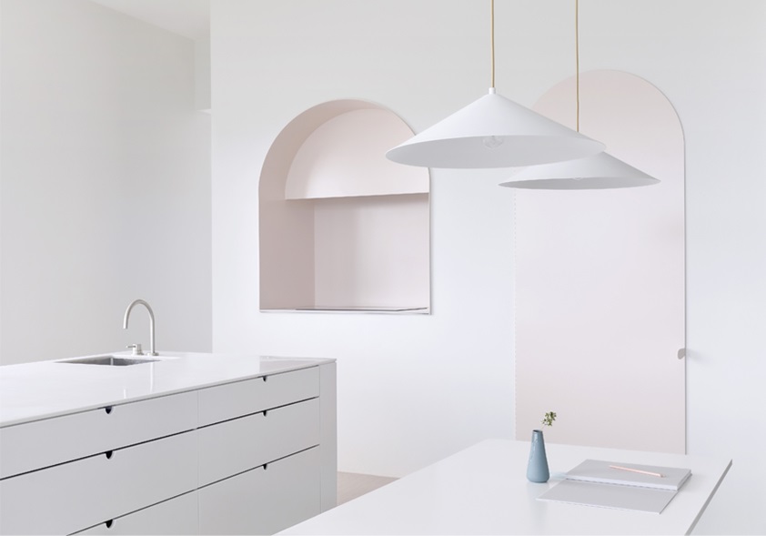

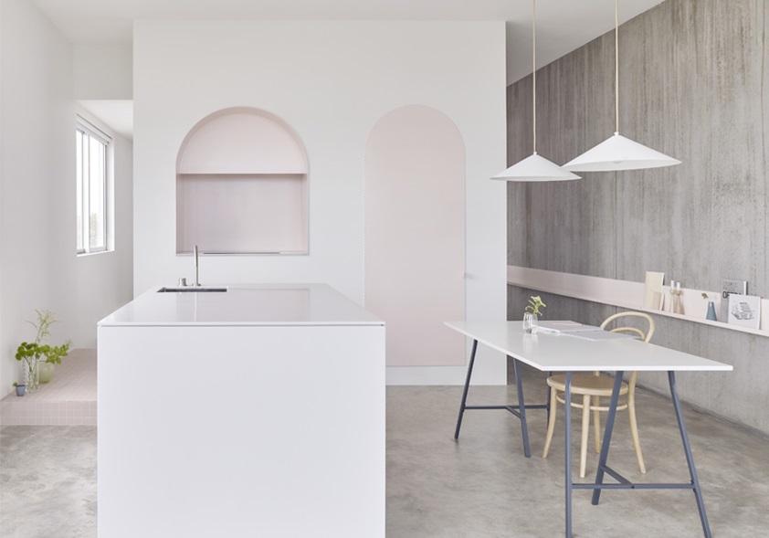

Although 50 per cent of our work was reconfiguration of spaces, the bit you mostly see is the kitchen. It was a big focus of the living space and we wanted it to appear as a backing of sculptural objects rather than a functional row of cupboards and appliances. Exposing the concrete floor and walls meant that the kitchen could be quite minimal in terms of finish and colour. We used Dulux Natural White paint, with joinery in a very soft, beautiful, subtle grey and soft pink metalwork, a white tabletop in Laminex Parchment and white pendant lights.
There’s quite an art to using white. How you perceive it once it’s lit in different ways can be quite different to what you might expect from a chip card or sample. And if you end up in a situation where there’s a mismatch, unless they’re separated, your attention is always drawn to it. But the use of white here was really important in allowing the subtle tone of the pink objects to come forward in the space. It also helped to accentuate both the natural light and the shadow play that emphasises the sculptural nature of the different objects.
Annabelle Bradbury from studiofour
The Bourne Road Residence is a new house that we designed for a young family. The clients’ vision was to live in a happy home that was calm and uncluttered, but they didn’t come to us and say they wanted a minimal white box. In fact, their brief was more about how the house felt than how it looked. But because it had to be cost-effective, we knew that finishes like plasterboard and laminates were likely to form part of our materials palette. One of the reasons the house evolved into a white canvas was our belief that plasterboard can be painted white and still remain honest and simple. It was also important to us that the colour of the ceilings, in particular, was the same as the exterior built form, as this would further ensure the integrity of the home.
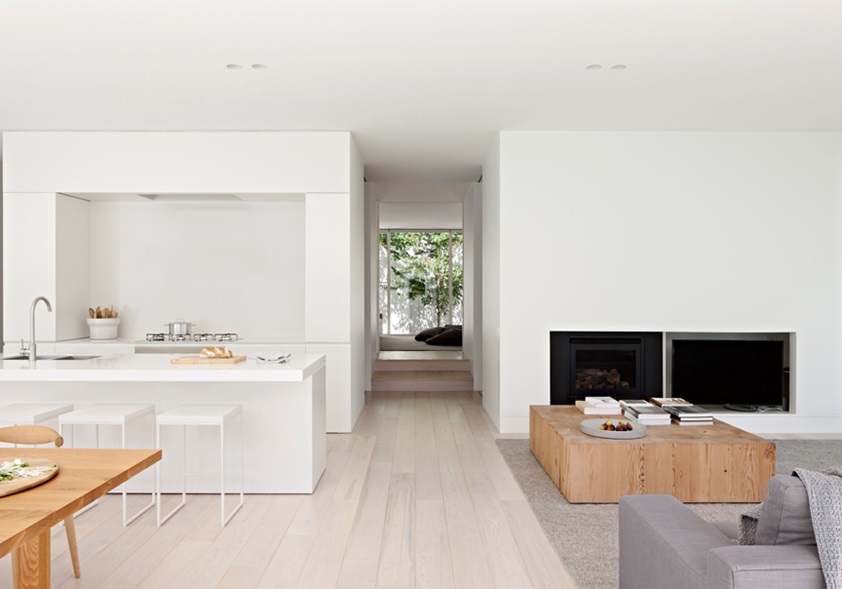

We chose Dulux Natural White for the walls and ceilings. It’s one of our favourite whites because it’s very warm but also quite pure. And it was a good match to the white laminate we’d chosen. Samples for different finishes can sometimes look similar, but they may act differently in different lighting conditions, so the key to matching them is keeping them in the same temperature range. And then, we design with shadow and light play in mind as this provides a forgiving environment for slight variations in tone and helps breaks up the mass of interior surfaces.
The brief called for a strong connection with the landscape, so we designed the threshold between inside and out to be effectively seamless, and the white of the interior then flowed out into the exterior architecture. Of course, the risk of doing an all-white house is that it can feel stark or mean, but we mitigated that here by making sure that the colour and texture of the landscape played an integral role in the interiors.
To learn more about all twelve decors in the Laminex White Series, including new decors Laminex Calm White, Chalk White and White Linen, click here.


