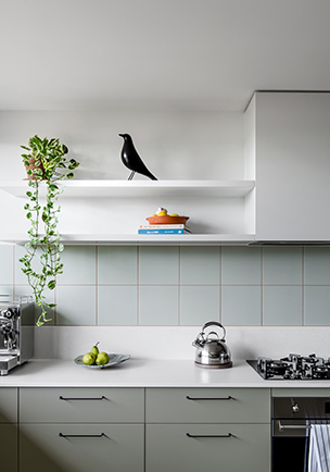
The expanded palette of neutral decors celebrates and supports the changing role of neutral colours in contemporary interior design.
In redeveloping the Laminex Colour Collection, our palette of neutral decors has been completely reimagined. Working directly with architects and designers, and looking at emerging movements in adjacent industries like paint and tiles, we'd seen how the role of neutrals in interior design was changing - particularly the strong movement to tonal interiors based around single colours, and the rise of organic colourways. So we redefined our own approach to neutrals to support that.
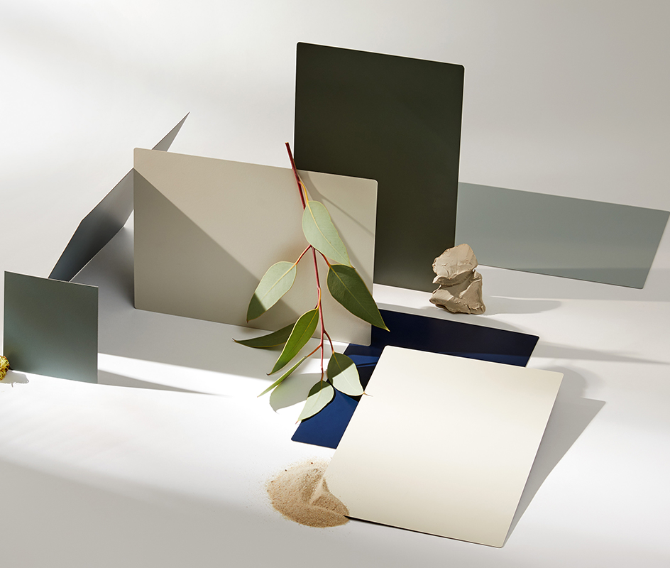
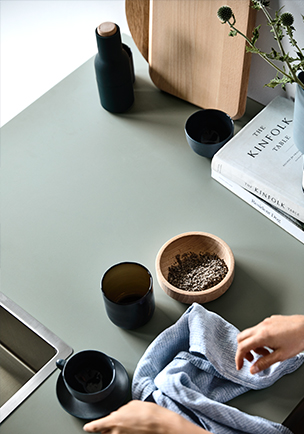
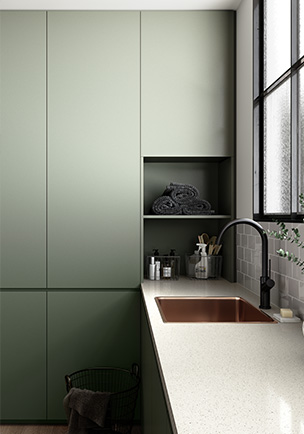
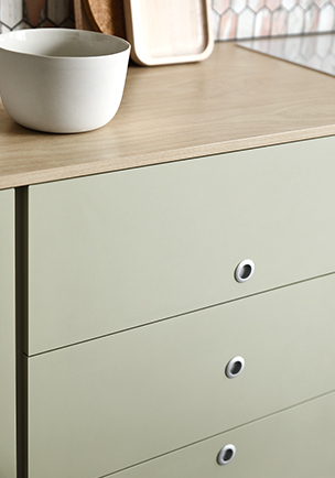
Our Whites & Neutrals palette includes all of the established decors that will continue to be important, with a comprehensive range of whites and mid-tone neutrals. Now these are joined by a carefully curated selection of beautiful muted greens, warmer mid-tone neutrals and deep, saturated colours. These new decors are still neutrals, in the sense that they're not exuberantly colourful, and can be used to set up a space and support hero elements. However, with an enhanced sense of depth and personality, they can be used as heroes in their own right, to define the aesthetic character of an interior.
Organic greens and warm mid-tone neutrals
“Our new decors reflect the rise in the broader design industry of these beautiful organic colourways,” explains Laminex Design Marketing Manager Catherine Valente. “Particularly the prominence of green in many forms, from emerald green and forest green to soft eucalypt tones.”
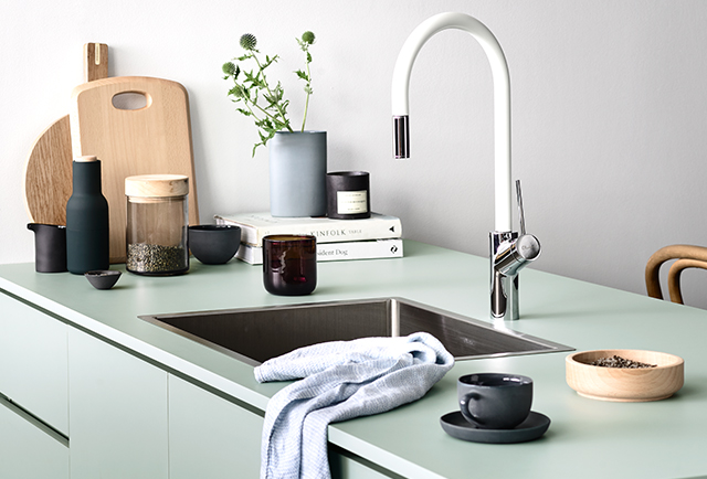
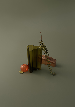
For example, there's Laminex Seed, a delicate yellow-green neutral with earthy undertones, ideal for use on its own in large spaces and beautiful in combination with warm timbers; Laminex Possum, a muted yellow-green with warm grey undertones that make it a great match for urban or organic palettes; Laminex Green Slate, a rich, warm-based green that Valente describes as “a starting point of the ‘army green' story that we see developing over the next few years”; and Laminex Spinifex, a soft organic green with a grey base, that's fresh enough to play a hero role but also a great match for soft concrete benchtops.
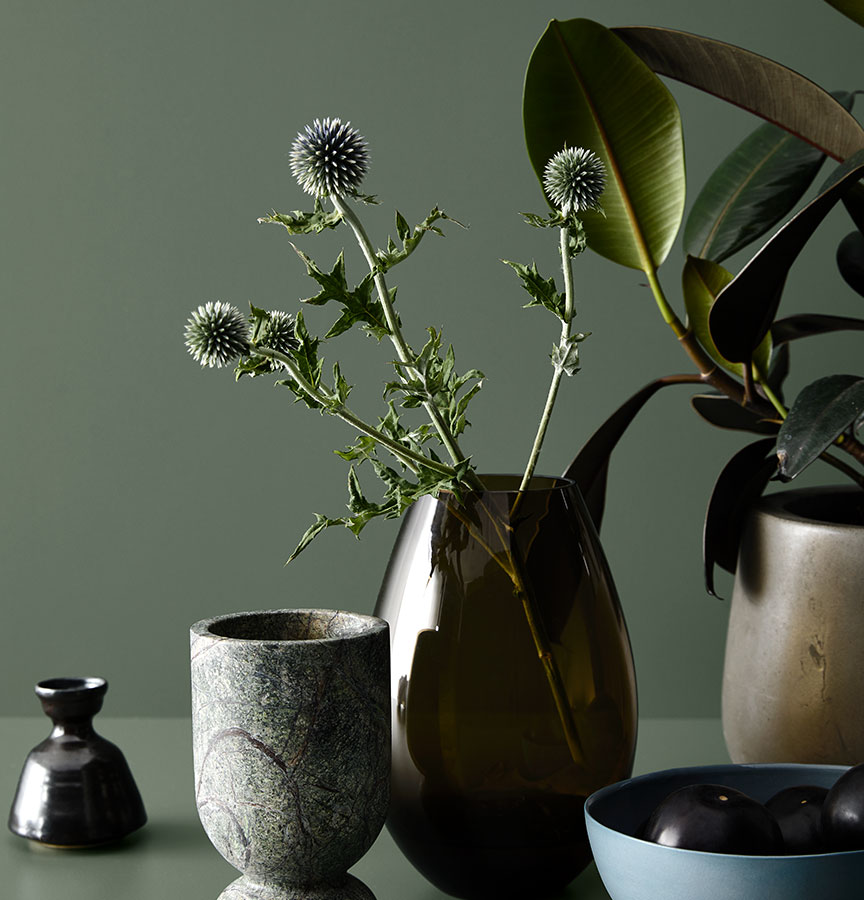

Like these organic greens, our new warm mid-tone neutrals were developed with the rise of large single-colour interior spaces in mind. So we have new decors like Laminex Alpine Mist, a stone-based grey with warm undertones that's equally suited to classic and contemporary interior styles; and Laminex Winter Sky, a deep, rich grey-based blue with a green undertone, almost like a new, contemporary take on teal. “Winter Sky is a really striking decor,” says Valente, “and its warmer tones make it highly versatile.”
The drama of sophisticated darker tones
Dramatic dark tones are continuing to rise in popularity in interior design and black remains a favourite for surfaces and finishes. However, as Valente points out, it can also be polarising for some. “As a result,” she says, “we developed stunning new rich tones based around deep, dark greys and blues.”
Valente describes Laminex Lava Grey as “the new perfect grey”. It's a rich mid-grey with a neutral base that works with both light and dark palettes, and can be adapted to contemporary, urban and classic design styles.
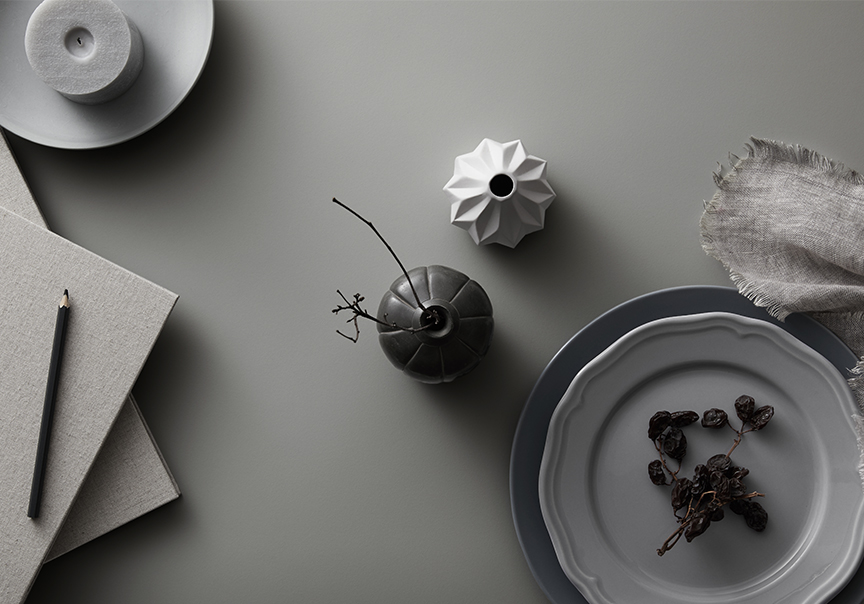

Laminex Terril is a highly saturated, rich grey with a blue base, that can be used as a feature colourway and works beautifully with timber elements.
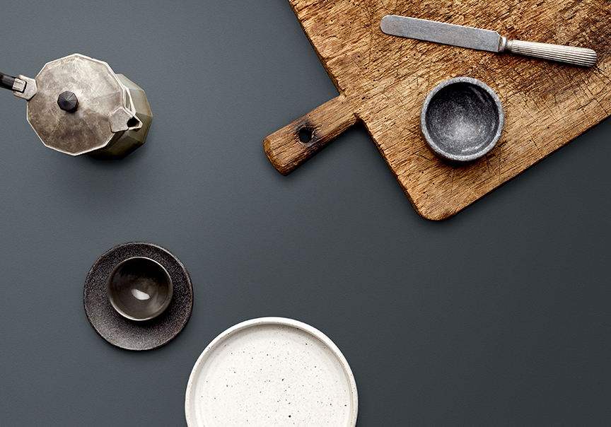

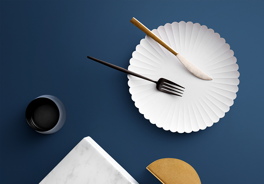
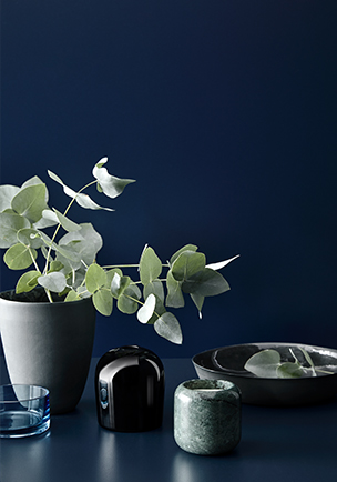
And Laminex French Navy is the kind of classic deep navy that's increasingly prominent in interior design right now. It's a great alternative, and complement, to black, and is also a perfect pairing with brushed brass fixtures and finishes.
