See The Light
New mixtures of nuanced bright colours, tinted neutrals and chalky pastels herald our resurgent optimism.
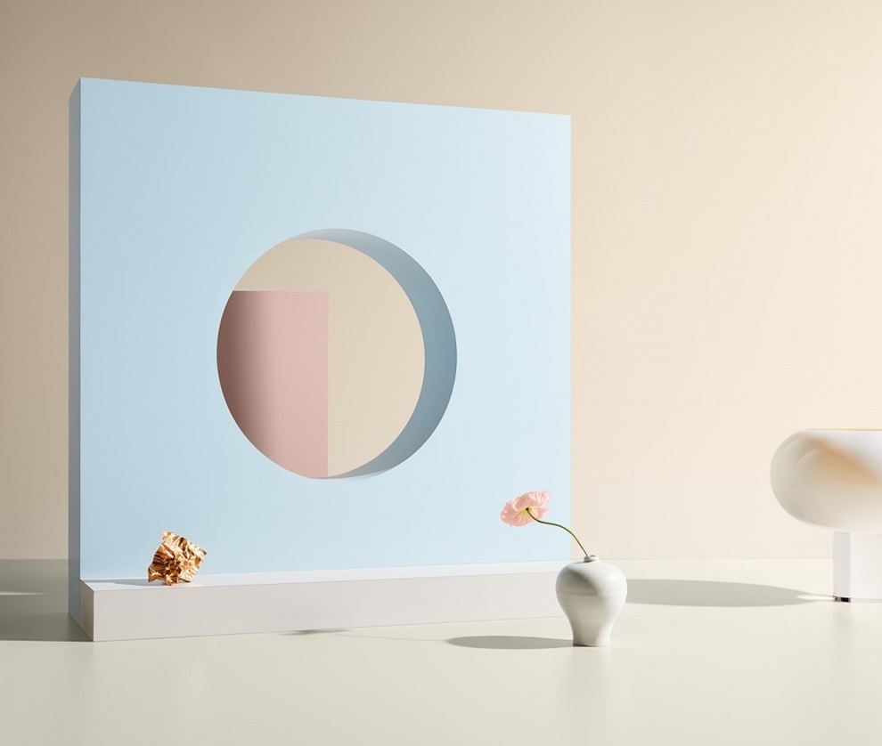
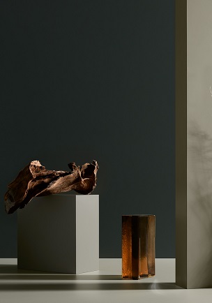
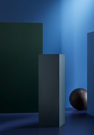
Faced with uncertainty about the future, we draw positive energy from self-belief and self-expression. And with this positivity comes hope. This mood can be seen in See The Light, with its fresher, cleaner tones and confident, eclectic use of colour. It offers an energising play on highs and lows, pairing nuanced bright colours with tinted neutrals. The powerful colours protect and give strength to the more delicate colours, and soft tones provide true sensitivity. These combinations suggest a fresh take on colour blocking, but even when applied in solid, flat fields, they retain a soft and tactile quality.
The Palette















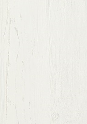

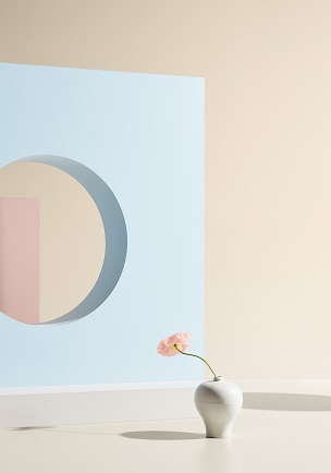
The emergence of chalky pastels brings broad appeal in both commercial and residential settings, and will be seen in textiles, tiles, floors and accessories. Open fibres and ribbed weaves, and contrasting matte and gloss finishes, invite the senses to react. Precious shapes mimic the natural forms of the ocean, and pearlescent, exquisite, sophisticated tones inspired by seashells create sparkling, ecstatic hues.
These colours may seem playful, but they have an essential classicism and elegance that brings versatility. Their fresh, contrasting tones encourage a fresh take on life, and will inspire an explosion of positivity and inner strength.
See The Light 1
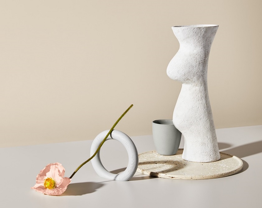


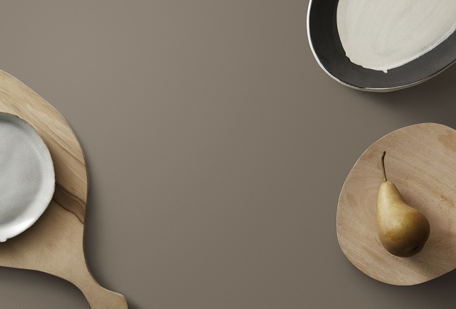
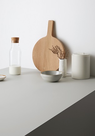
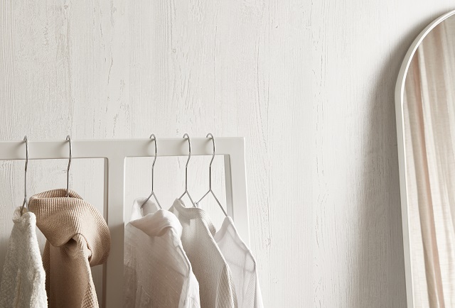
There’s a freshness, almost a sparkle, to this palette, and it’s highly versatile. Laminex White Painted Wood* (coming soon*) works in both classic and contemporary interiors. It’s also a great match for Oyster Grey and Pewter, two of the most popular greys in the Laminex Colour Collection, which in turn provide a strong base for softer tones like chalky purple Dulux Lilac Light. The mix of matte and textured finishes aligns this palette to products from adjacent industries for 2020. It will pair well with terrazzo surfaces, and tiles and accessories in matte finishes.
See The Light 2
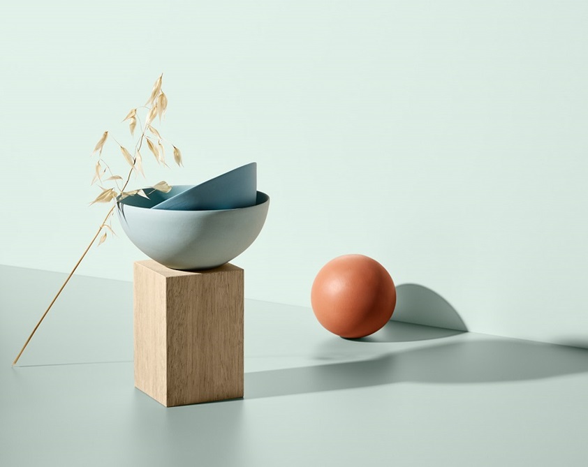


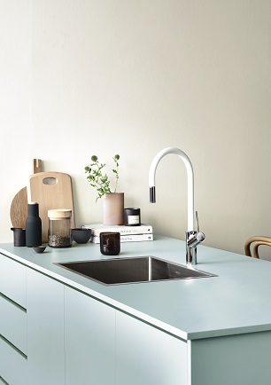
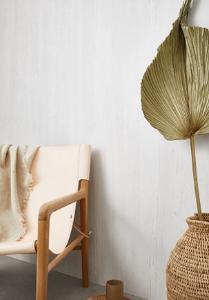
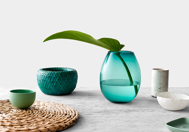
The bright colours here take colour blocking in a fresh new direction. Delicate green-blue Laminex Aquamarine and pastel blue Fresh Spring sit beautifully with light timber Waxed Maple. The warmth of Tenderfoot makes it a perfect neutral for 2020 and supports the introduction of terracotta tones, typified by Dulux Yolande, that will grow in prominence over the next two years. This is a great scheme for commercial spaces looking for a sophisticated but fun feel, especially food shops and clothing or homewares stores with products in a soft organic palette. It has a slightly retro quality but with a freshness that engages the senses.
See The Light 3
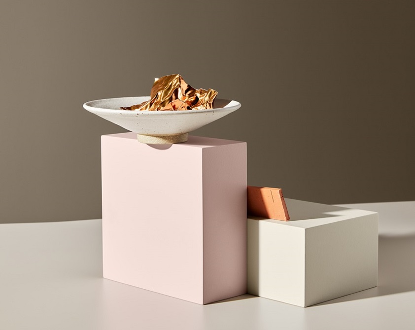


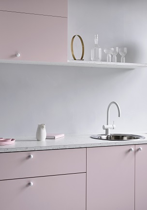
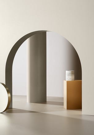
Balancing the pink blush of Laminex Just Rose and Matte Rose Gold with the warm neutral tones of Raw Cotton and Earth takes this palette into a highly appealing gender-neutral space. Raw Cotton brings freshness against the deeper brown Earth, and both work as statement cabinetry tones. Applying Matte Rose Gold as a feature accent and Just Rose as feature accent or on internal cabinetry, has a softening effect. At the same time, these more gentle decors draw strength from their contrast against the deeper tones, including deep orange Dulux Orangeade. Adding breeze blocks or glass bricks will heighten the palette’s vintage appeal.
